Some Simple Proofs I Came Up With On My Way To Work

It typically takes me anywhere between 10 to 15 minutes to get from home to the office each morning. In that span of time, while on the ride to work, I always enjoy drifting aimlessly from one random thought to another. And so, it was in that wandering state of mind that I stumbled into a couple of fairly straightforward but nevertheless interesting proofs to some fairly basic math statements.
Image from Pixabay
Image from Pixabay

While browsing through my Twitter followers list yesterday, I was quite surprised to find Fermat’s Library (@fermatslibrary) as one of my followers. Of course, I followed back that very moment and found a few tweets from their timeline that really jumped out at me:

Apparently, these are very brief proofs concise enough to fit in a tweet, hence the #ProofInATweet hashtag.

The only problem was that the proofs were presented as photos, something which my screenreader couldn’t help me with. So I decided to do the proofs myself, but I neither had the time nor the motivation right there and then to try working through them (it was a Sunday, after all, and I had a few book chapters to finish reading yesterday).

It was only today while en route to work that I really got the chance to ponder about this more carefully. And around the time I arrived at my desk, right before I started checking my emails, I was finally able to put everything together. Please note that it was already way past my bedtime when I wrote this post, so do check my calculations as I’m quite certain I screwed up somewhere. That said, here’s what I came up with.
Continue reading “Some Simple Proofs I Came Up With On My Way To Work”
Using GeoPandas to Build Updated Philippine Regions Shape File in Python

In a previous post that took a look at CPI inflation rates by region, I sort of bemoaned my inability to find up-to-date Philippine shape files that already included the newly-formed Negros Island Region in most open GIS databases. As a result, we simply had to make do with what was available and plotted the regional inflation rates for the month of June 2016 as if the NIR didn’t exist. Well, it turns out, I was a complete idiot for being unable to figure out a workaround to the problem. The solution just hit me all of a sudden last week in the middle of a lucid dream, and is embarrassingly so simple that I’m still kicking myself at time of writing for not having thought of it sooner.

In this post, I’ll try to go over how I went about generating a (hopefully) up-to-date and accurate shape file for the Philippine administrative regions using the very handy Geopandas package in Python. I’m by no means an expert in GIS data analysis (in fact, I’m not an expert at anything), but I’m sharing my approach and results anyway for anyone interested.

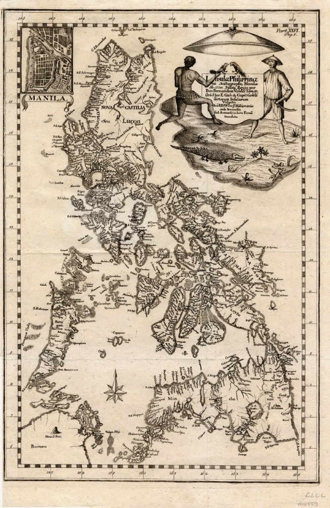
An 18th century map of the Philippine Islands, dated 1774. (Image from Wikimedia Commons)

What follows is an edited and repackaged version of the Jupyter notebook I’ve put together to generate the shape file. Along with the complete code, the dataset (the original shape files) and other related stuff can be found in this GitHub repository. Or, if you just want to skip all that and simply download the new shape file, just click here to access the zip file. Otherwise, read on.
Continue reading “Using GeoPandas to Build Updated Philippine Regions Shape File in Python”

Charting PH History through the President’s SONA

The 16th President of the Philippines is scheduled to deliver his first annual State of the Nation Address (SONA) later today. While I’m certainly looking forward to hearing a fellow Davaoeño lay out his future plans for the entire country, I’m also quite curious how President Duterte’s first SONA speech is going to go down in history.

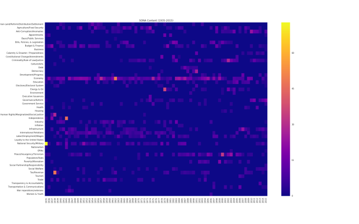
Since 1935, there has been a total of 77 SONAs delivered by 13 Philippine presidents, focusing on the most pressing issues facing the nation. If we measure how much attention a particular President has given a specific topic in his/her SONA speech (in terms of how often he/she mentions keywords related to such topic in the address) and plot the result, it would look something like this:

SONA topics, 1935-2015, in percentages. (Chart by DC Dabbler with data from the Presidential Museum & Library)

So what does this tell us about the previous eight decades in Philippine history? Quite a lot, actually, but in this post, we’ll go over just the most interesting bits and hopefully pick up something along the way.
Continue reading “Charting PH History through the President’s SONA”

Digging into the June Inflation Numbers

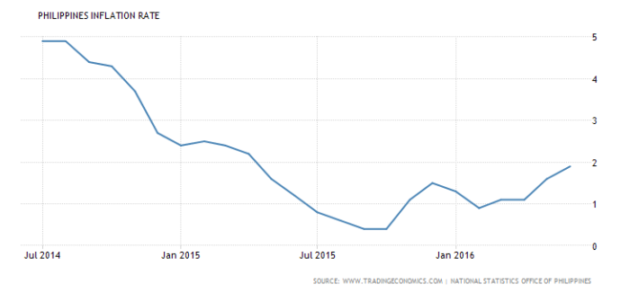
Last week, the PSA released CPI inflation figures for the month of June, and the headline inflation rate came in at 1.9% year-on-year at the national level. While there’s almost nothing special about the latest CPI numbers (except that the headline rate reached a 14-month high), there seems to be something quite interesting going on when we look at the latest aggregate and commodity-level CPI inflation rate on a region-by-region basis.

Philippine CPI inflation rate, June 2014 to June 2016. (Chart from Trading Economics)

So let’s see what happens when we map the change in consumer prices by region.
Continue reading “Digging into the June Inflation Numbers”

Revisiting the Accuracy of SWS and Pulse Asia Pre-Election Polls

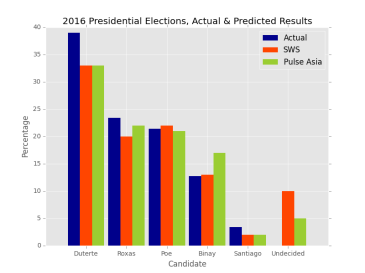
Monday afternoon saw the official proclamation of this year’s Presidential and Vice-Presidential election winners. Now that the most divisive election in recent history is finally over, it’s time to move on with our lives. But before we put everything behind us and go back to whatever it is we preoccupy ourselves with, let’s take one last look at how well the polling predictions of SWS and Pulse Asia turned out in this election. To save you the trouble of reading through this entire post (which, by the way, will admittedly be a short one), here’s the single chart that sums up nearly everything I’ll talk about in this entry:

The 2016 Philippine Presidential election, actual vs. predicted (Chart by DC Dabbler with data from Wikipedia)

The Main Results

I don’t precisely know how these guys do it (perhaps a sampling methodology granted by the god of probability?), but it seems they really can tell who’s going to win the election way before the fact. In fact, they’ve managed to predict the winning Presidential candidate correctly in every election since 1998. In the business of guessing the future, that’s an enviable winning streak.

But as we’ve seen in a previous post, being able to correctly point out the winner isn’t the only measure of an election pollster’s accuracy. When we take a look at the other facets of polling correctness, we find that SWS and Pulse Asia surveys seem to show mixed levels of success in the recent elections.
Continue reading “Revisiting the Accuracy of SWS and Pulse Asia Pre-Election Polls”

About That COMELEC Data Breach: It’s Dangerously Huge

Over a week ago, I was lazily browsing headlines on Hacker News, minding my own business, when suddenly my entire world view was irreversibly turned upside-down after I came across Web security expert Troy Hunt’s excellent blog post on the recent COMELEC data leak, the irresistibly but aptly titled entry “When a nation is hacked: Understanding the ginormous Philippines data breach”. It turns out, despite what the folks at COMELEC would have you believe, the hyperbole in this case isn’t only warranted, it’s the only way to capture the sheer scale of this mess into words we humans can grasp.

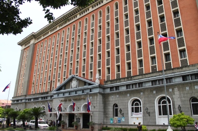
COMELEC, Palacio del Gobernador, Intramuros (Image from Wikimedia Commons)

When I first read about the data breach as it was initially reported in late March, I simply shrugged it off as nothing more than election-related fodder for the politically-inclined (a region in the Venn diagram of the Philippine online community that I’m only tangentially aligned with). COMELEC’s early assessment of the situation painted the incident as garden-variety online vandalism, supposedly having no serious consequence except causing temporary inconvenience for visitors of its site. Very reassuring.

But days after the intrusion event and with a string of unexpected twists and turns in the unfolding story, it was becoming clear that this might be far more serious than what the polling agency cared to publicly admit. And now, nearly a full month has passed; all signs clearly show that this thing is massive and that potentially millions of verified voter for the upcoming elections are at risk of being royally screwed. If you think I’m exaggerating, then read the rest of this post. If not, just read on anyway.
Continue reading “About That COMELEC Data Breach: It’s Dangerously Huge”

4 Things That Can Screw Up the Accuracy of Pre-Election Polls

In a previous post, we tried gauging the accuracy of SWS and Pulse Asia opinion polls for the three most recent Philippine presidential elections by applying the widely-used Mosteller metrics. Based on these measures, we found out that the two main polling bodies tend to predict the outcome of presidential races with a decent degree of correctness. We, however, didn’t look much into possible factors that could negatively impact pre-election polling accuracy, and so it’s only fitting that we consider these things as well, especially in light of the ever-evolving and very tight 2016 presidential race we’re seeing lately.

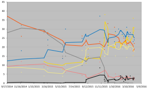
Opinion polling in the 2016 Philippine presidential election using moving averages (Chart by Howard the Duck/Wikipedia)
Opinion polling in the 2016 Philippine presidential election using moving averages (Chart by Howard the Duck/Wikimedia Commons)

An oft-repeated caveat you commonly hear in investing is that past performance isn’t necessarily indicative of future results, and nowhere is this view more valid than in the business of predicting election outcomes. While this warning may not seem immediately apparent in the Philippine polling experience (since we only have a small sample of comparable data points and none of which involve any disastrous forecast errors so far), there have been several notable instances in the democratic world’s recent history in which polling organizations’ election predictions not only missed the actual outcome by a huge margin but also pointed to the exact opposite results.
Continue reading “4 Things That Can Screw Up the Accuracy of Pre-Election Polls”

The 2016 Presidential Race, as Told by Wikipedia Page Edit Counts

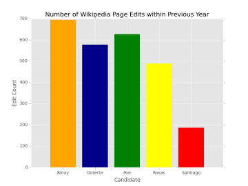
It turns out, if you rank the five 2016 Presidential candidates by the number of revisions made on their Wikipedia pages during the preceding 12 months, the rankings more or less tend to reflect the results from one of last month’s pre-election opinion polls. This is clearly shown in the chart below, in which Vice-President Jejomar Binay’s and Senator Grace Poe’s respective Wikipedia pages appear almost running neck and neck in terms of page revision counts, with that of Mayor Rodrigo Duterte’s Wikipedia entry following very close behind.

Number of Wikipedia Page Edits Within the Previous Year Ending 13 March 2016 (Chart by DC Dabbler)

But that’s only half the story. When we take a look at time series plots of revision counts for the candidates’ Wikipedia pages over the past three years, we find even more curious (or spurious?) patterns start to emerge.
Continue reading “The 2016 Presidential Race, as Told by Wikipedia Page Edit Counts”

On the Accuracy of Pre-Election Polls: SWS vs. Pulse Asia

Whether you trust them or not, pre-election opinion polls and surveys are as part of the Philippine election season as the candidates themselves. As you may very well know, the bulk of these measurements are taken by two major organizations: the Social Weather Stations (SWS) and Pulse Asia. While there’s certainly a healthy dose of caution surrounding the trustworthiness and reliability of the pre-election survey results these two pollsters publicize, the fact remains that SWS and Pulse Asia both have a track record of predicting the outcome of past Philippine presidential elections with reasonable accuracy, especially at forecasting the winner and candidate rankings. In this post, we’ll make use of some widely-employed yardsticks of polling precision to gauge how well each of the two survey sources performed in previous Philippine presidential elections.

2010 Presidential Election

01_2010_results
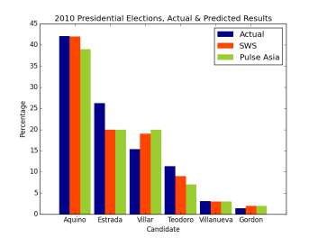
Actual and Predicted Election Results for the 2010 Presidential Election (Chart by DC Dabbler with data from Wikipedia)

As shown in the above figure, both SWS and Pulse Asia got the correct rankings of the presidential candidates for the 2010 elections. SWS really nailed down the 42% of votes received by Benigno Aquino, III, while Pulse Asia’s results were off by a little over 3 percentage points, exceeding a 2% margin of error.
Continue reading “On the Accuracy of Pre-Election Polls: SWS vs. Pulse Asia”

Midyear Gut-check: The PSEi in H1 2015

Time really flies when you’re having fun, especially in the stock market. It seems like it was only yesterday when we pondered about the previous year’s PSEi performance in this blog. Now, we’ve just reached the halfway point of the trading year, and it’s about time we sit back once again and take a hard look at what the benchmark did during the first half of 2015.

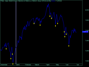
Price Chart of the PSEi Composite, H1 2015 (Screenshot by DCDabbler)

From the above chart, it’s clear the past six months have been quite interesting for the PSEi main index. In this post, let’s find out what major events moved the market during this period; which of the blue-chip stocks gained and lost the most; how the PSEi’s performance compares to other exchanges; and which PSEi stocks are still relatively cheap as of end H1 2015.
Continue reading “Midyear Gut-check: The PSEi in H1 2015”